Since its founding in 1888, Swinerton’s success has been built on a foundation of shared values. As a 100% employee-owned company, every individual has a personal stake in its success.
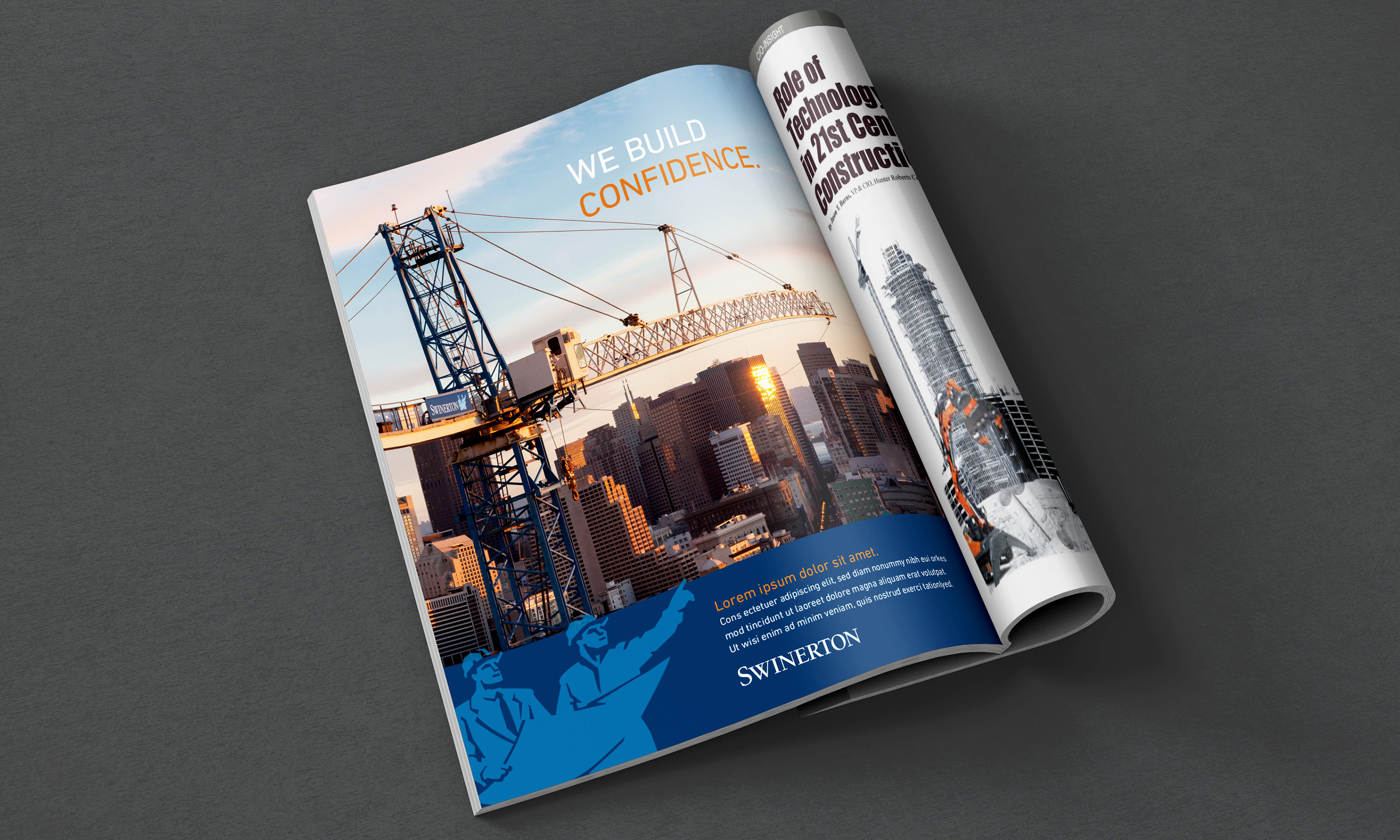
Rebranding a company with such a rich history and heritage is never an easy task. After conducting rounds of surveys and research both internally and externally to understand the company’s perception, we developed “Built with Pride” as the brand positioning platform that will guide the company’s future.
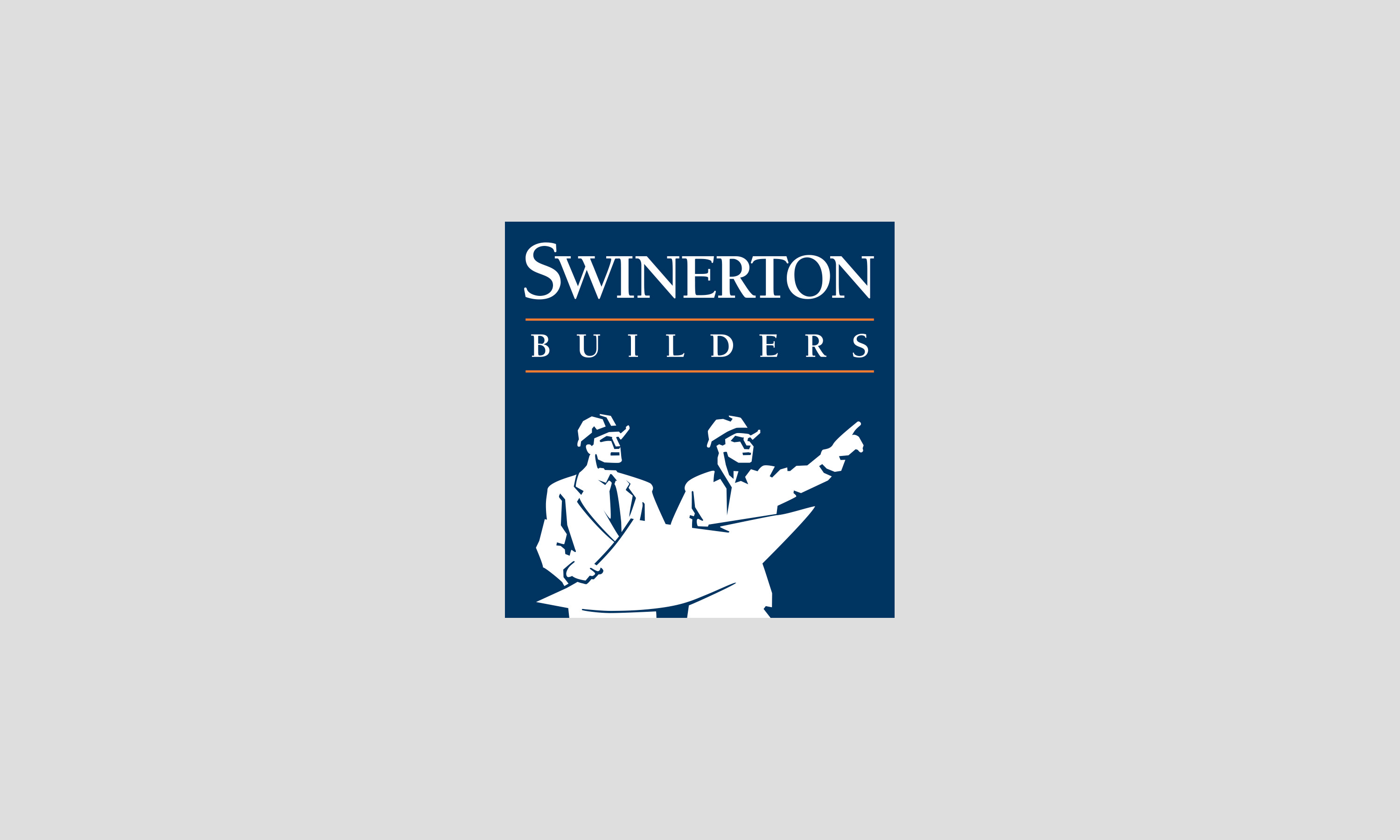
Old logo

New logo
A new era brings a new symbol.
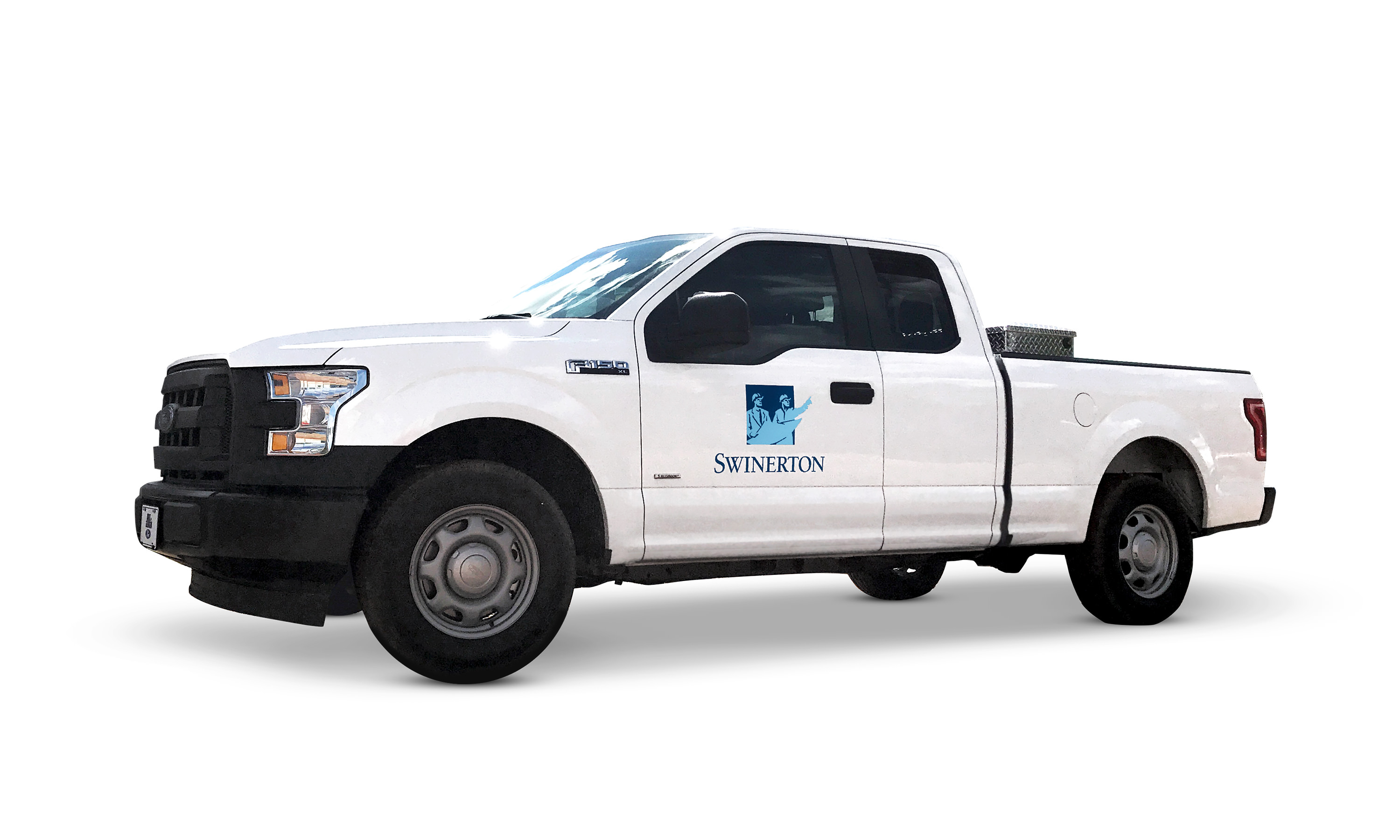
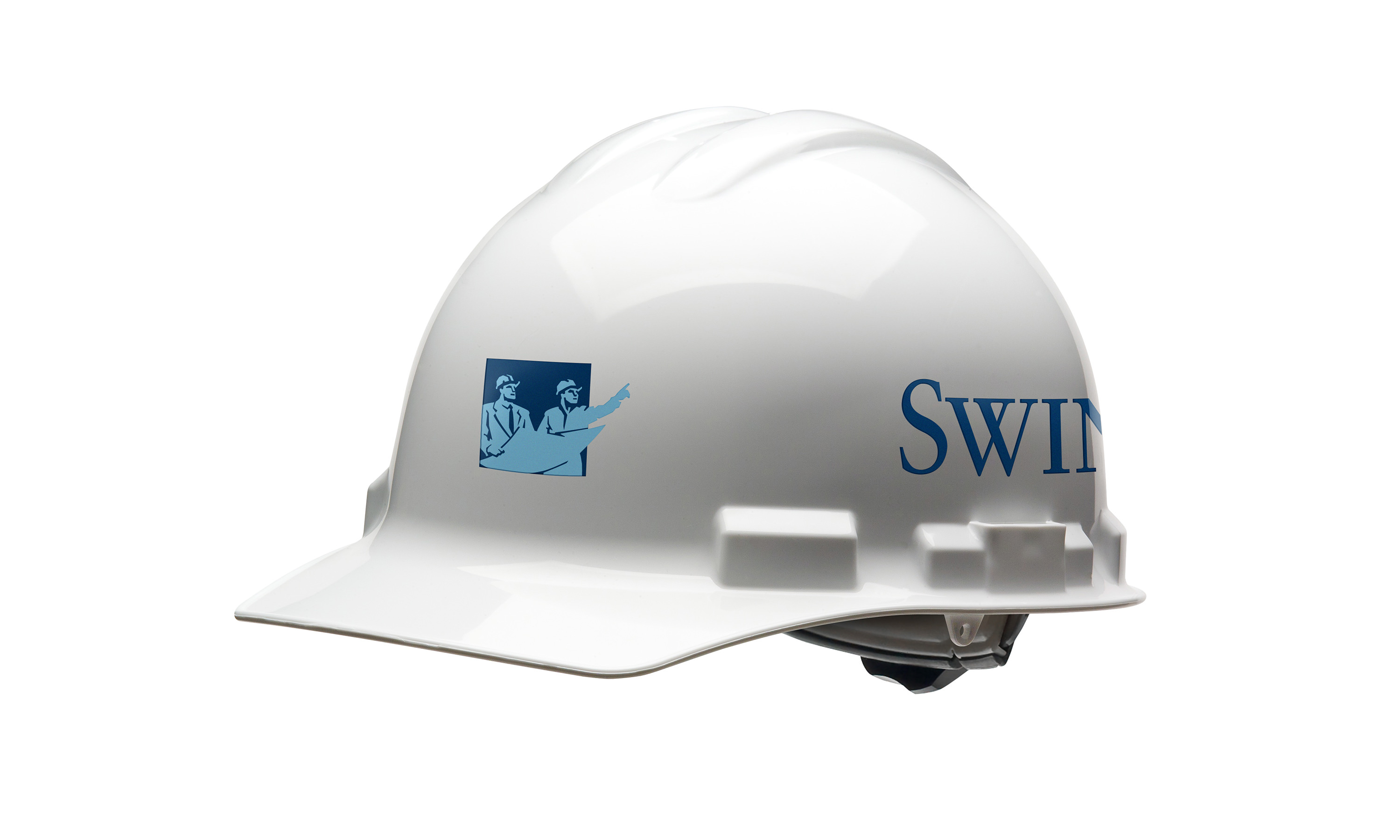
The “Swinerton pointing men” is both iconic and unique. Given its strong brand equity, there’s no need for reinvention; instead, we should focus on refinement.
The new logo signifies a departure from the norm, marking a new era for the company as it explores non-traditional market spaces, such as database warehouse construction, wind farms, and solar panel projects.
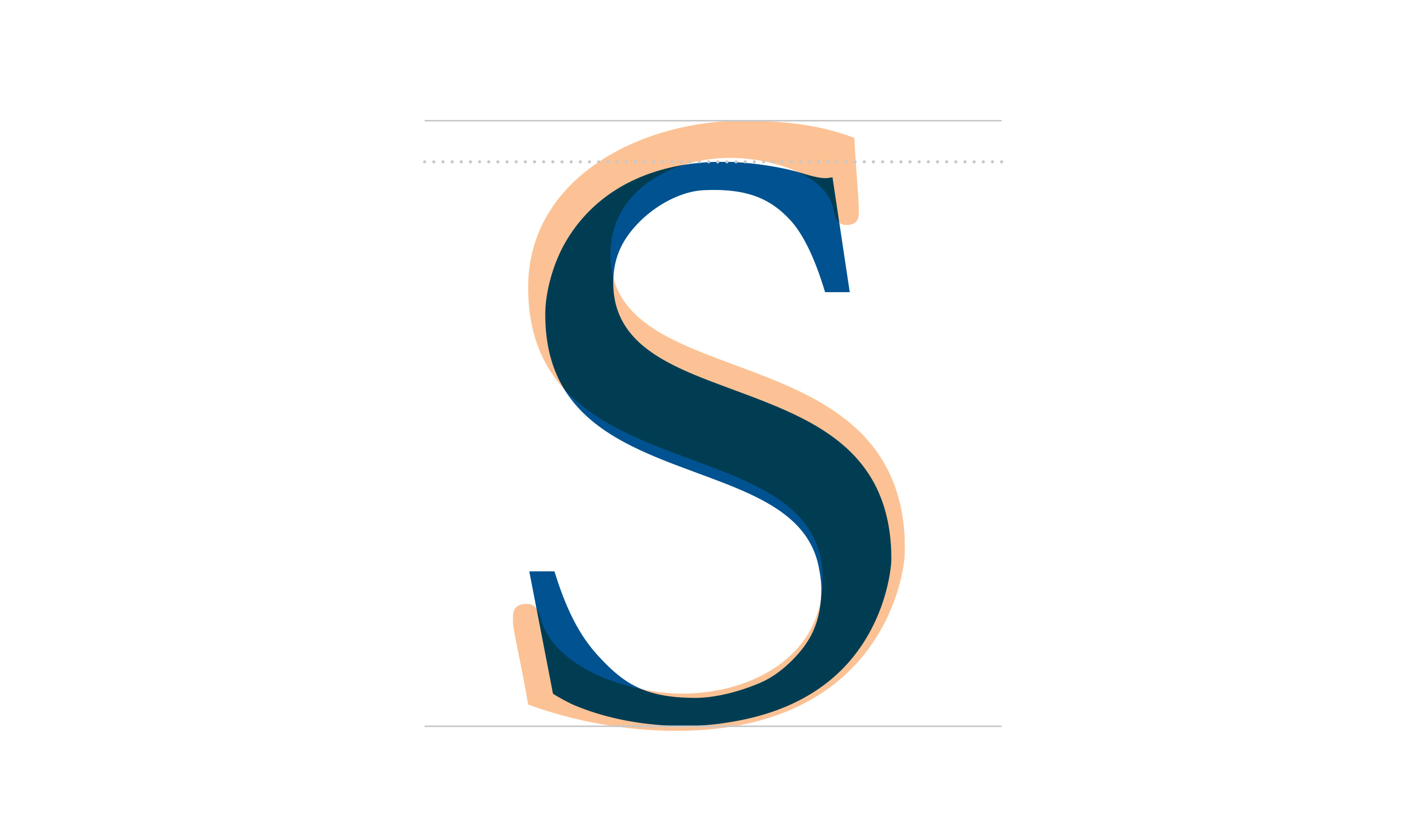

True beauty lies in the details.
The new logotype is carefully crafted to provide a classic yet refined appearance, with particular attention given to the letters “S” and “W,” subtly honoring the company’s founders, Swinerton and Wahlberg.



Our Stripes
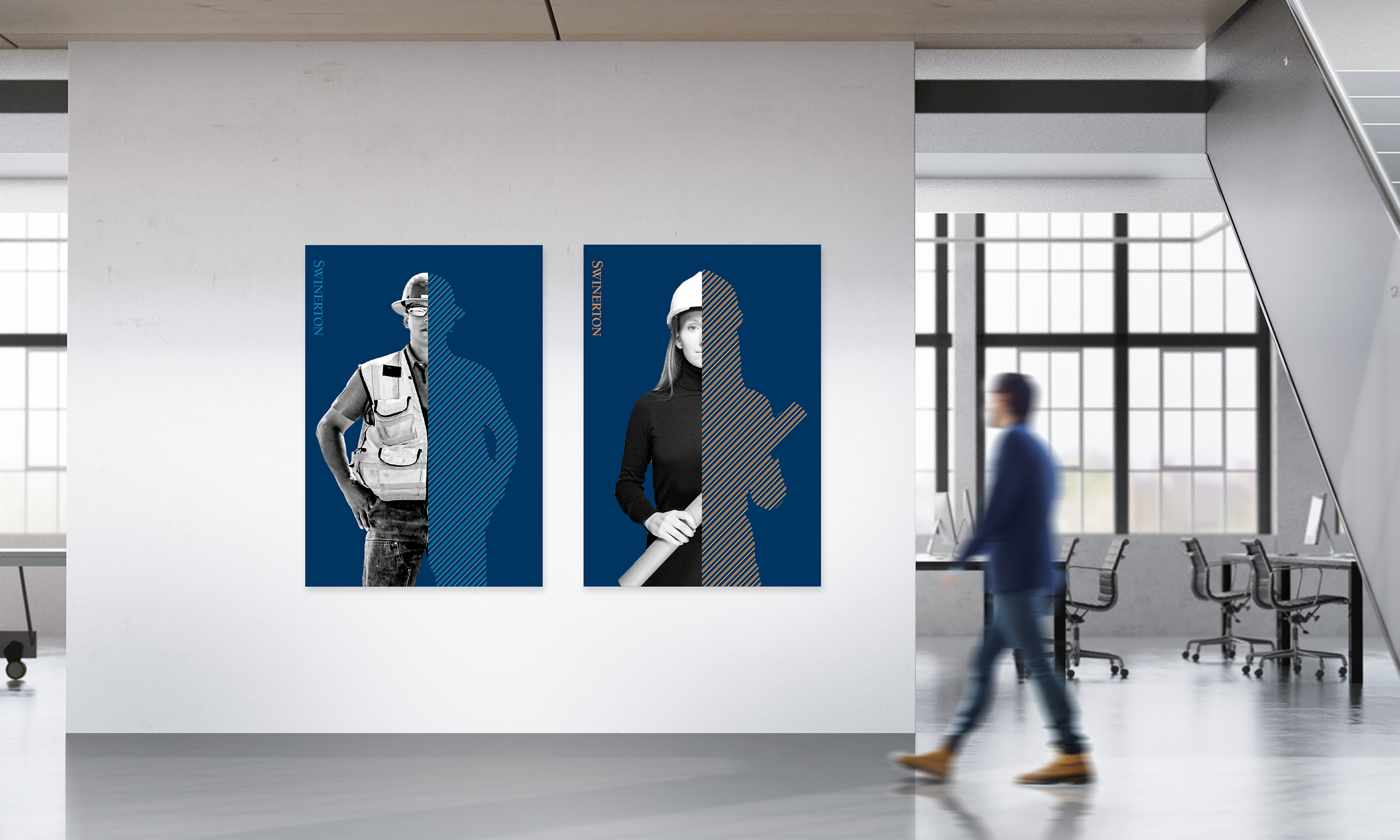
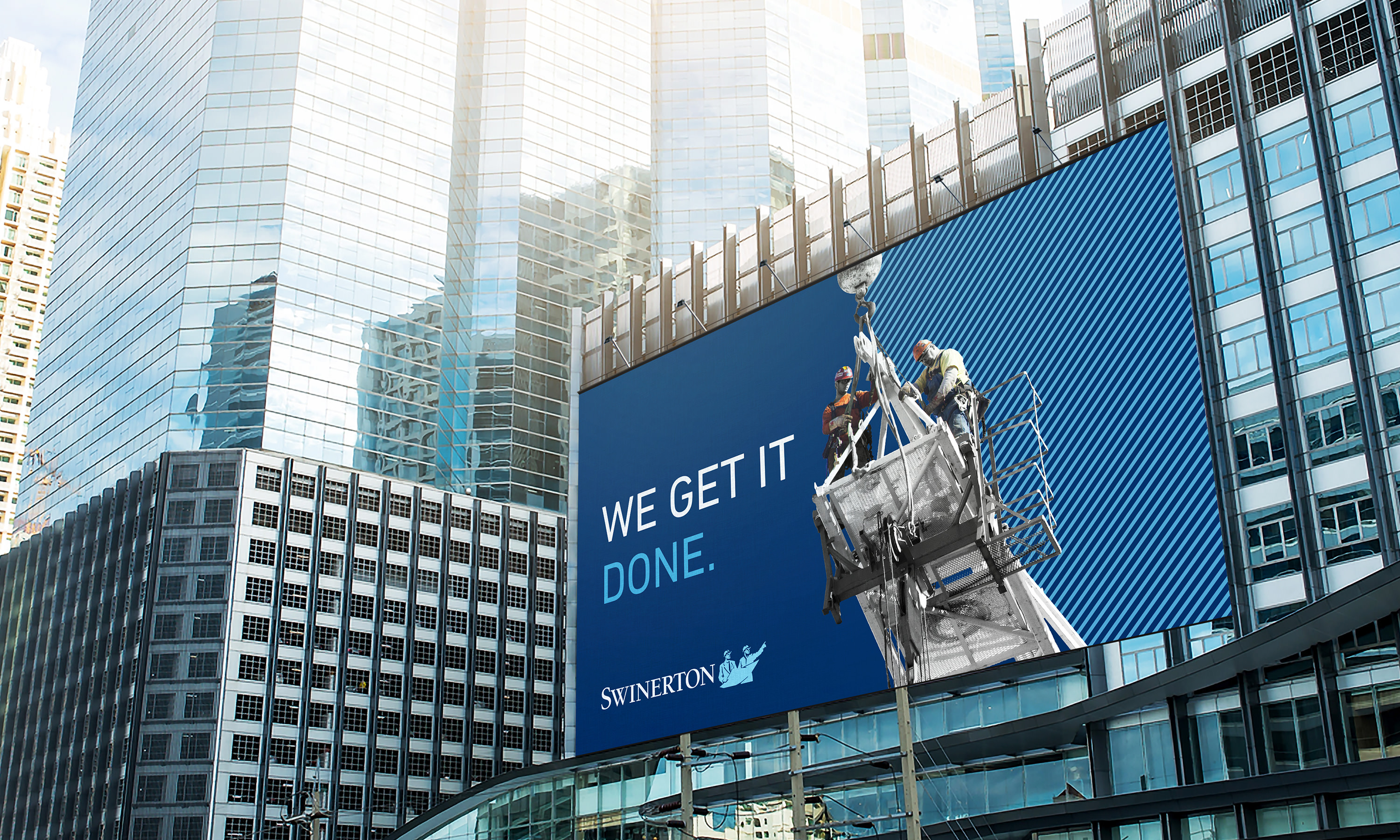
“We earn our stripes every day, and wear them proudly as a badge of honor.”
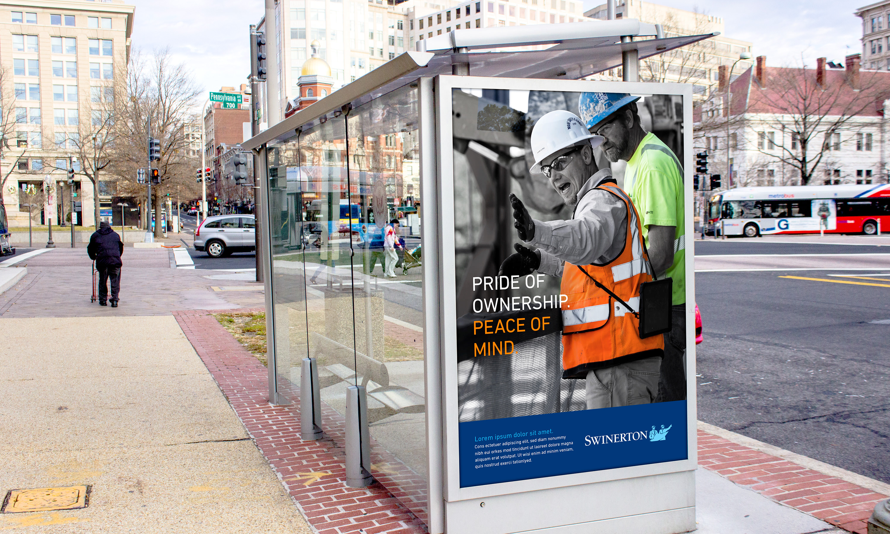
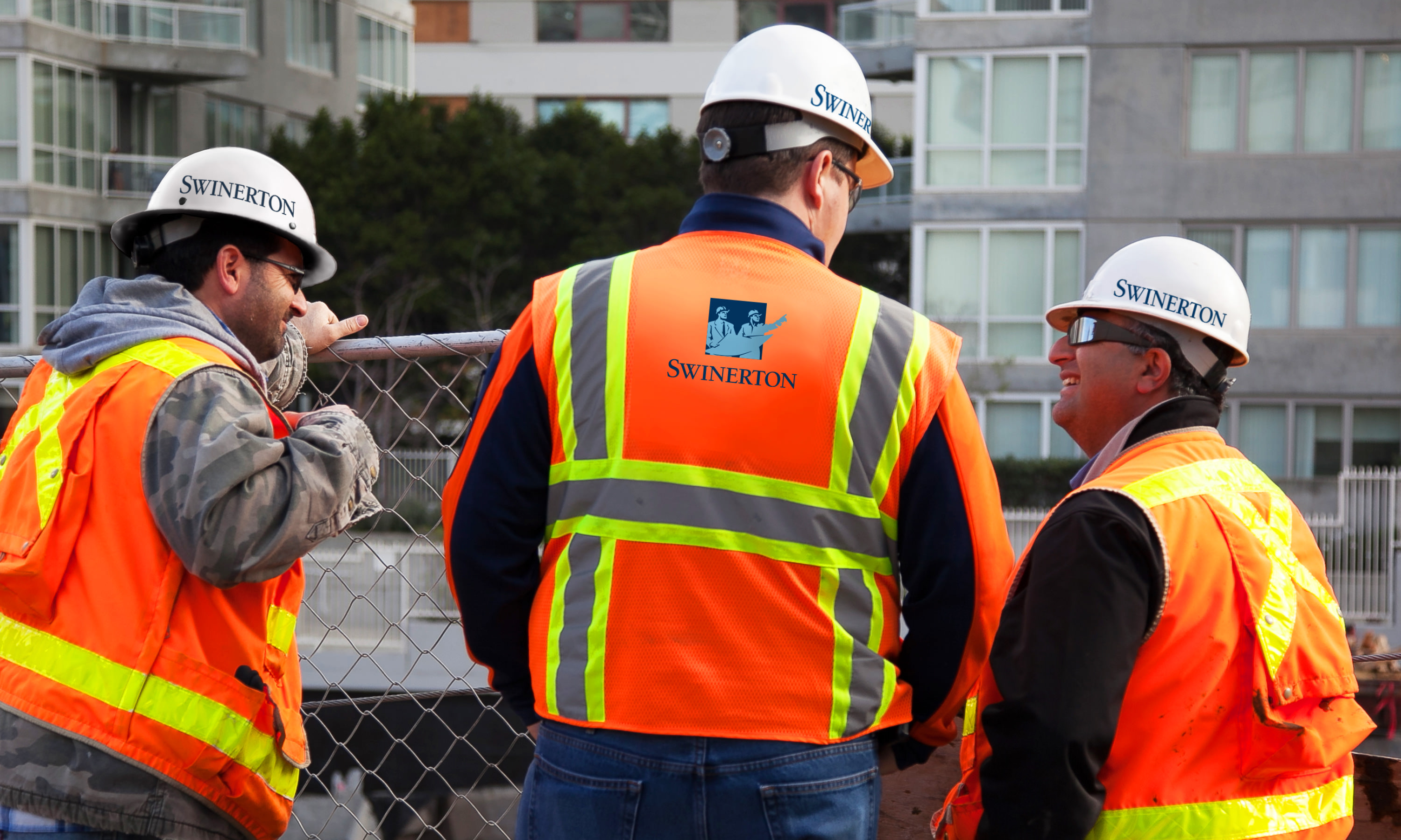
As a fully employee-owned company, the sense of pride and confidence is embodied in everyone, from the front office to the team members in the field.


Grid system
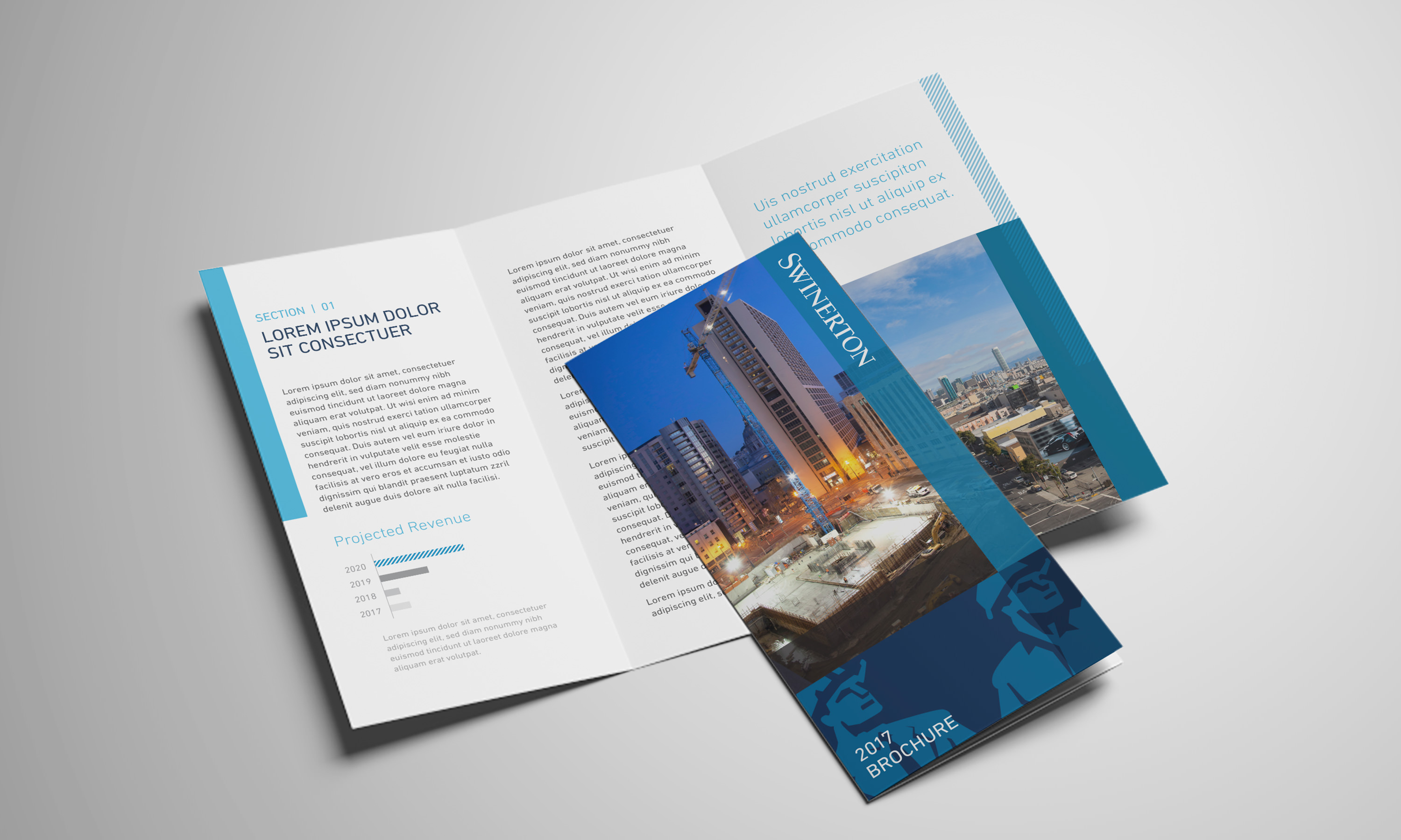
The grid system is expertly crafted to organize and unify all visual communications within the company. This adaptable framework not only embraces variability but also establishes a robust foundation from which a diverse array of graphic solutions can be developed.


