CU Direct, now Origence

CU Direct has been a trusted name in the auto loan industry and among credit unions for over twenty years. However, in a rapidly evolving world, the company needs to adopt new strategies and innovate to remain competitive in the future.
The rebranding effort is a step taken by CU Direct to prepare for advancements in technology and innovation.

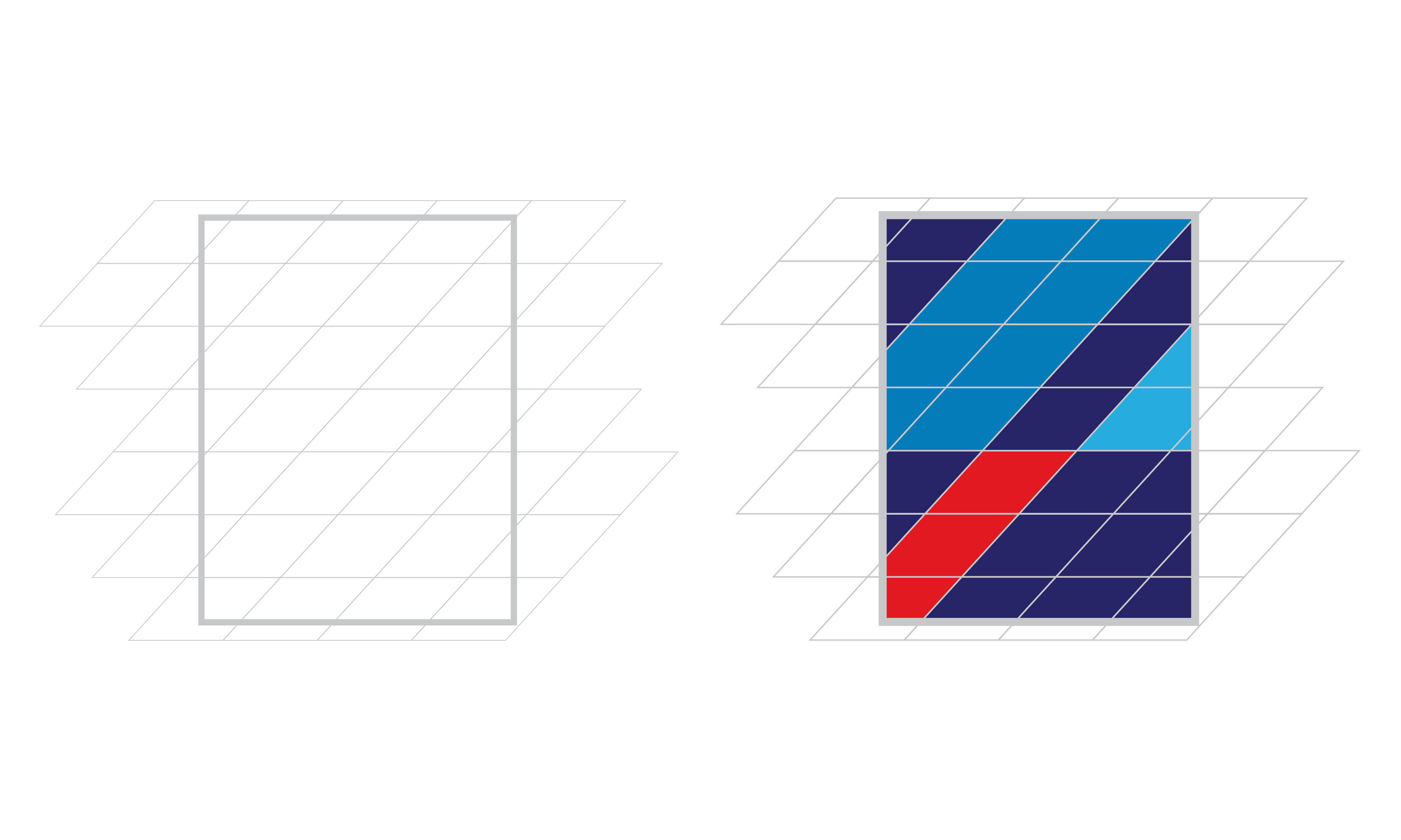
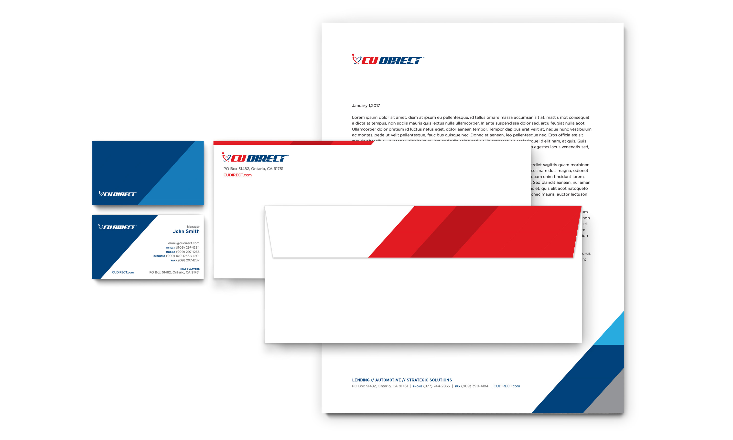
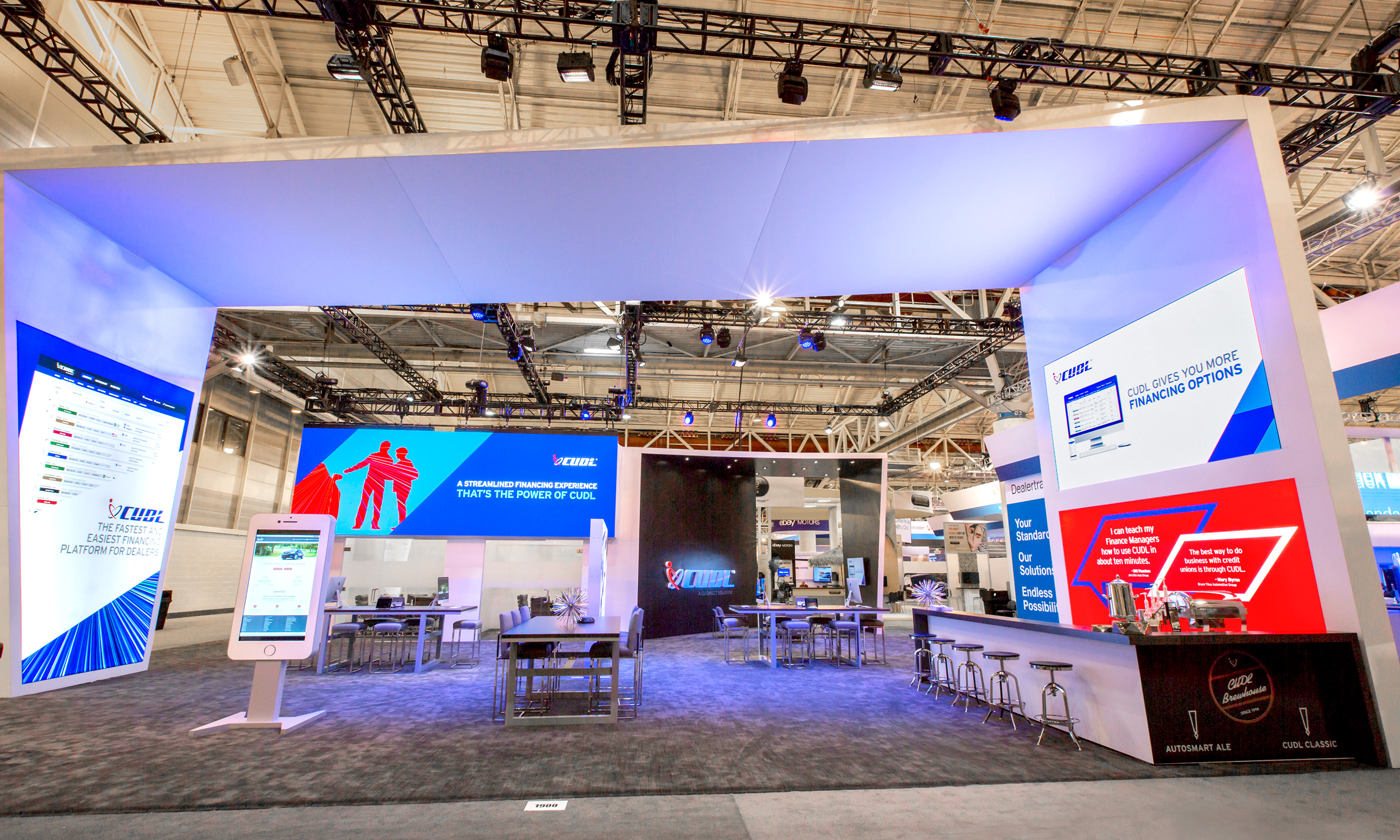
Performance Pattern — A dynamic grid-based system adaptable to a variety of applications. Its striking angular design embodies the speed and vigor of CU Direct’s operational philosophy, reflecting a commitment to excellence and efficiency.

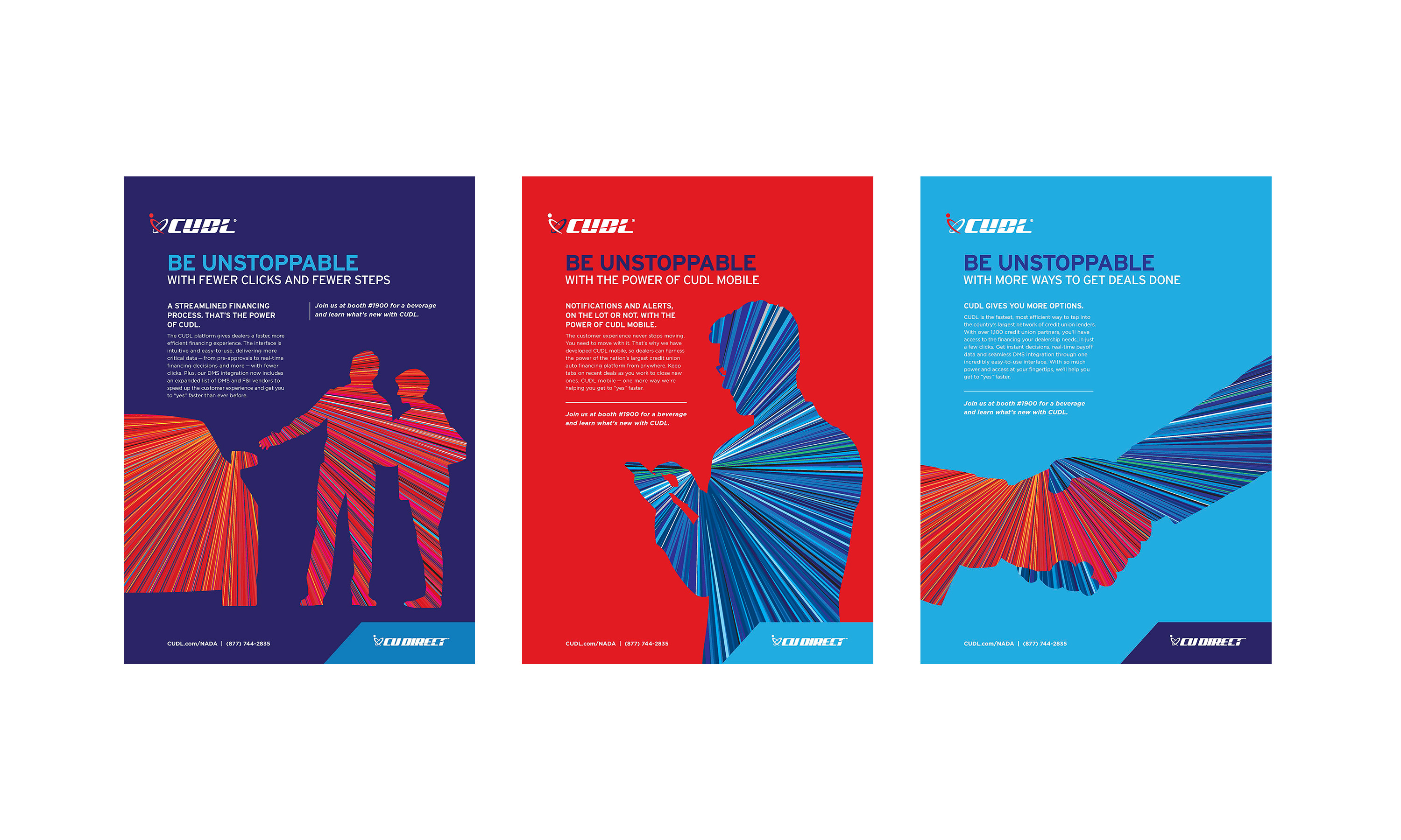
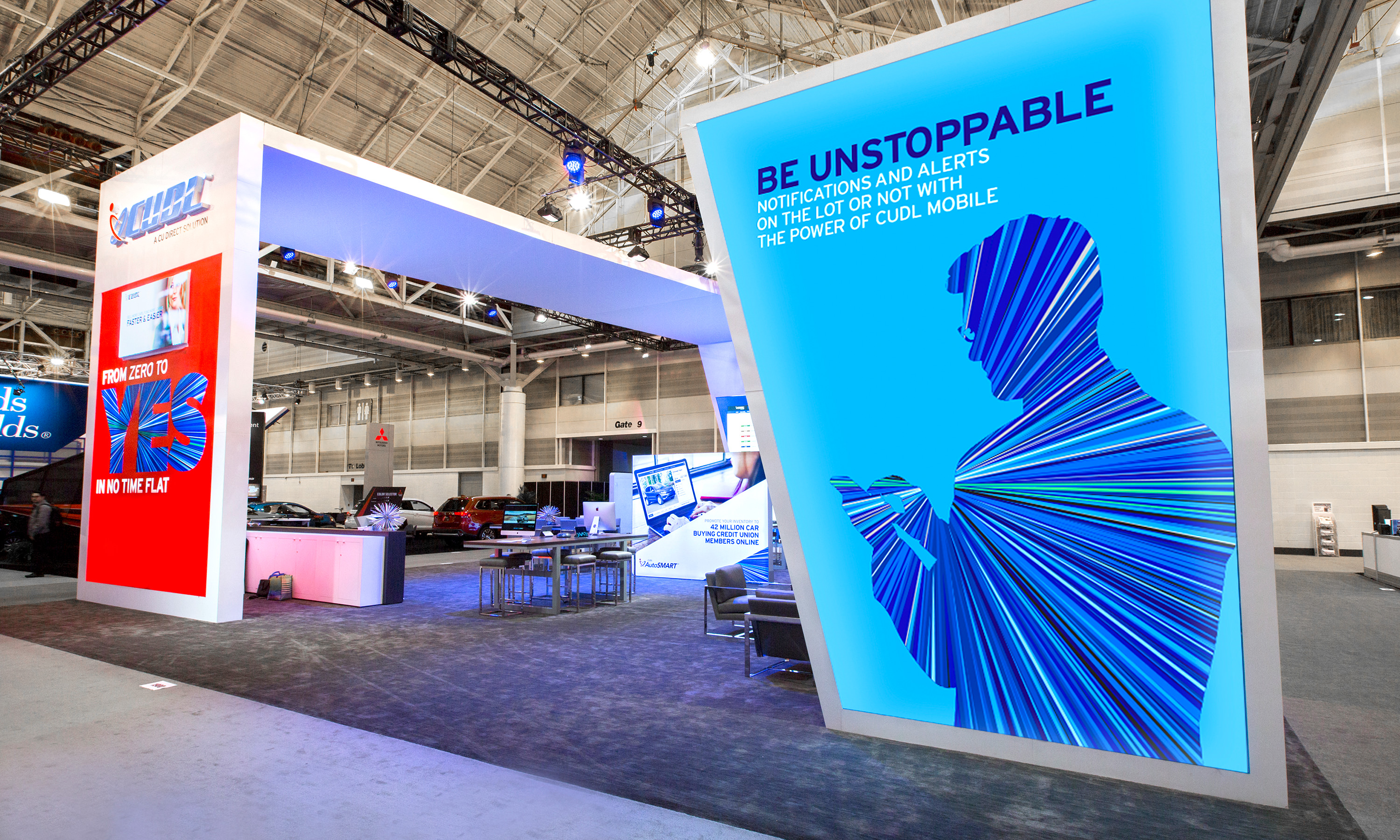
Innovation Lines — A compelling supporting graphic that captures the essence of the company’s spirit of innovation and technology-driven focus, highlighting CU Direct’s dedication to pioneering advancements in the industry.

Performance pattern is flexible and can be used on many different graphic applications.