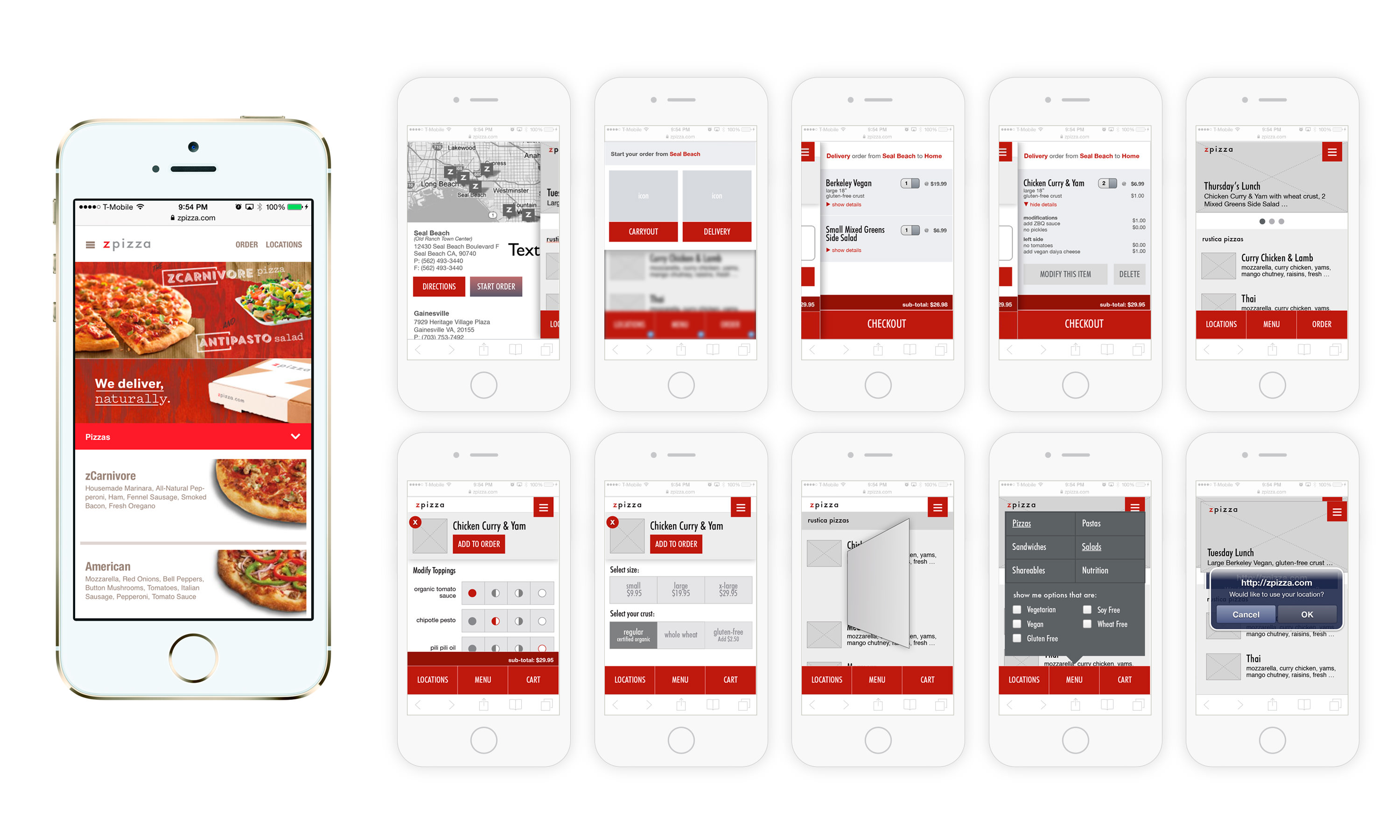
In the digital age, mobile-first thinking is the key to succeed in the high level of competitors.
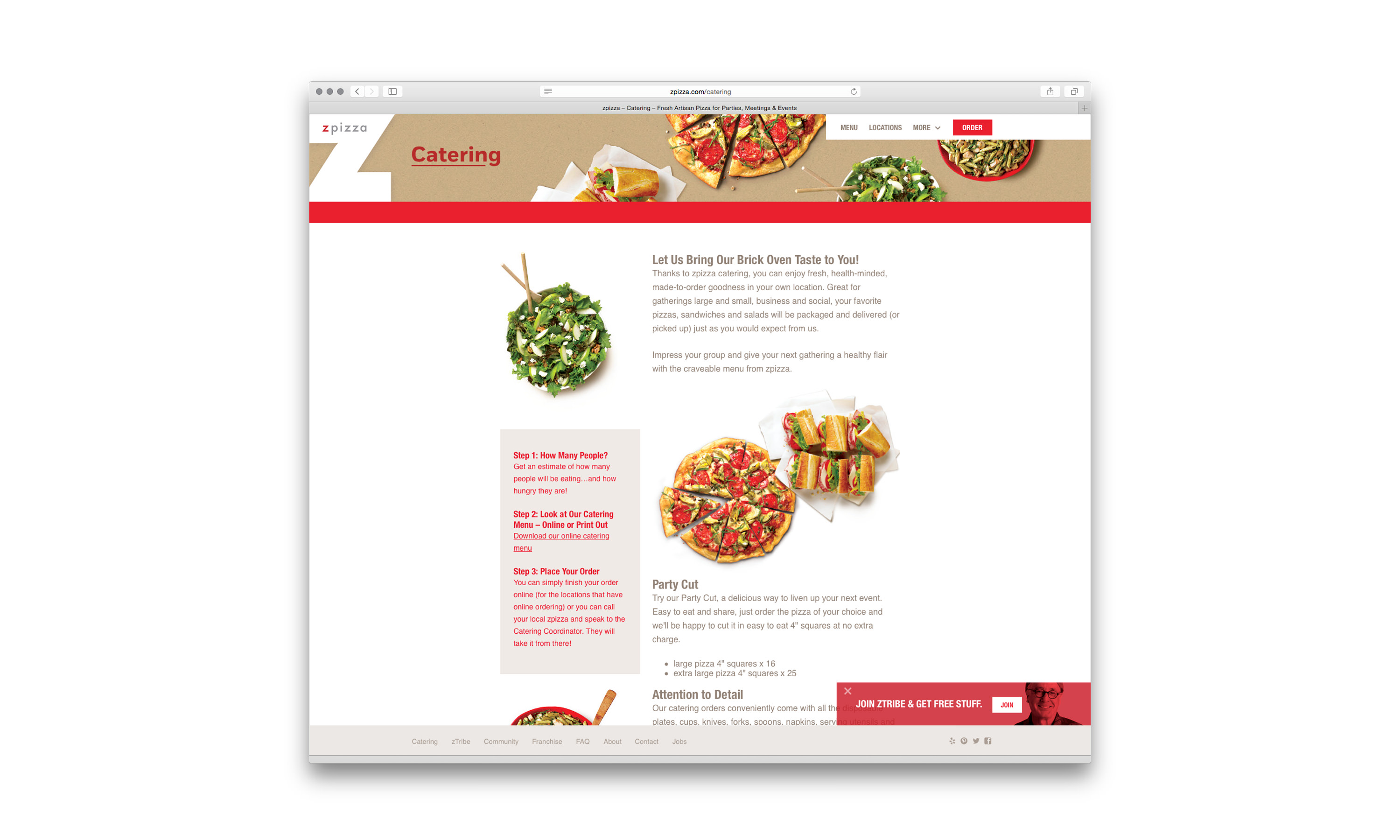
zPizza responsive website translates seamlessly from desktop to an “app-like” mobile experience with intuitive layout and cleanly designed UI.
zPizza is a national pizza franchise offers great tasting hand-crafted pizzas to the masses. Its focus on using freshly-prepared organic ingredients and first-of-its-kind gluten-free pizza crust (way before gluten-free was even a thing) gain a cult-following of foodies and health-conscious people alike.
In an effort to strengthen its online capability, zPizza turned to its agency partner to lead the charge of refresh its website and online order process.
As lead designer of its agency of record, my role was to lead its visual and user-interface redesign, with support from others in users and competitors research, and also collaborate with zPizza’ a marketing department, in-house developer to address user-experience and user-journey and flow. And finally, present my findings to stakeholders for sign-offs.
Challenge
One of the main challenges in this project was due to zPizza franchise structure limitation – Because the way zPizza construct its franchise agreement, individual franchisee have the rights to overlook certain corporate governance and can act as an individual rather than a branded unity.
This translate to, in regard to this project, an ordering process that is not streamlined and not user-friendly. For example, each individual store may elect to close early, some might cancel a pizza ordering without corporate approval, or some might not provide delivery services. And to design an experience that is unified, simple and user-friendly is no small easy task.
Research
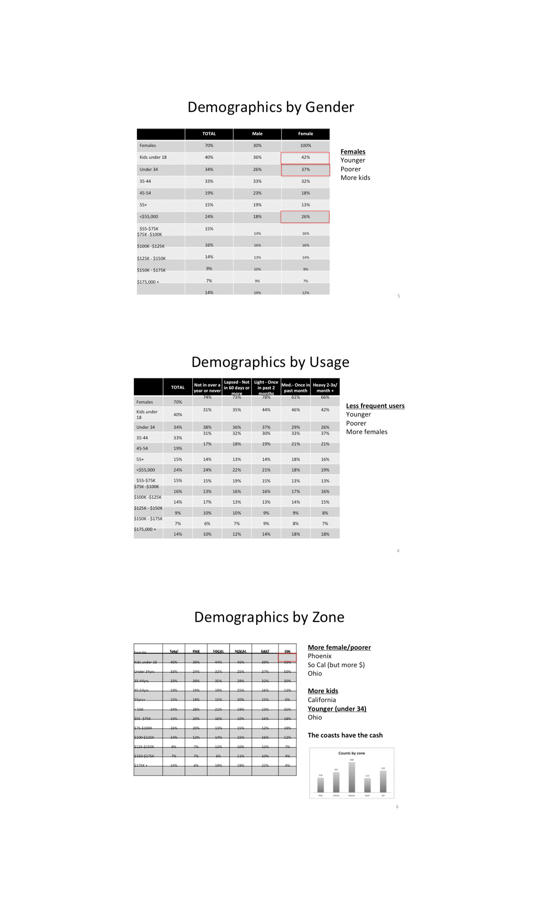
The research is approached on two fronts – on one end, zPizza has commissioned Reynold Design Group to research on demographics, target groups, competitor analysis, and brand perceptions.
On the other side, our team, with the help of zPizza’s marketing department… and the lure of free pizzas, conducted surveys with over 75 zTribe members (zPizza’s reward and loyalty program). As well as surveying 25 store owners to gain insights into their views and pain points.
Some of the touch points are:
- What comes to your mind when thinking about our website/ordering process?
- How often do you use our product/website?
- How does our website compare to (competitors’ website)?
- Which feature of our website are most important/least to you?
- What is your preferred payment/delivery method?
Discovery
The takeaways are:
- Ordering and services among zPizza stores are not consolidated – not all stores carry to some pizza options or offer the same services (i.e. different closing times, no delivery, using different POS system, etc.)
- Customers of zPizza often have more “sophisticated” taste – demanding better taste, placing higher value on experience, and willing to pay a premium for it
- zPizza has a unique naming of its pizzas – Names such as Napoli, California, or Berkeley Vegan pizzas, while sounds special and unique, confuse customers for not likely have an understanding of what kind of pizza or what ingredients are in them.
To counter these issues, we elected to:
- Our ordering system needs to be customizable on a per-store level. We must identify or allow the user to select a store location early-on (not after) in order to show the correct menu items and service status. The location selection method must be fast, easy and intuitive.
- Offer complete freedom to customize the pizzas and incorporate an input field for write-in instruction. This would enhance the ordering experience and give customers the feel of artisan and crafts.
- Make sure images of pizza are front-and-center with ingredient description simple and easy to see.
We identify three persona types to help guide for UX process. Since most online order users (75%) are male, we selected three male archetypes. They are – Brand the team captain, Trent the gamer, and Barrett the busy daddy.
Using these personas, we placed importance into our concept design in terms of ease of use, tech savviness, usage, repeat orderings, and so forth.
Wireframes
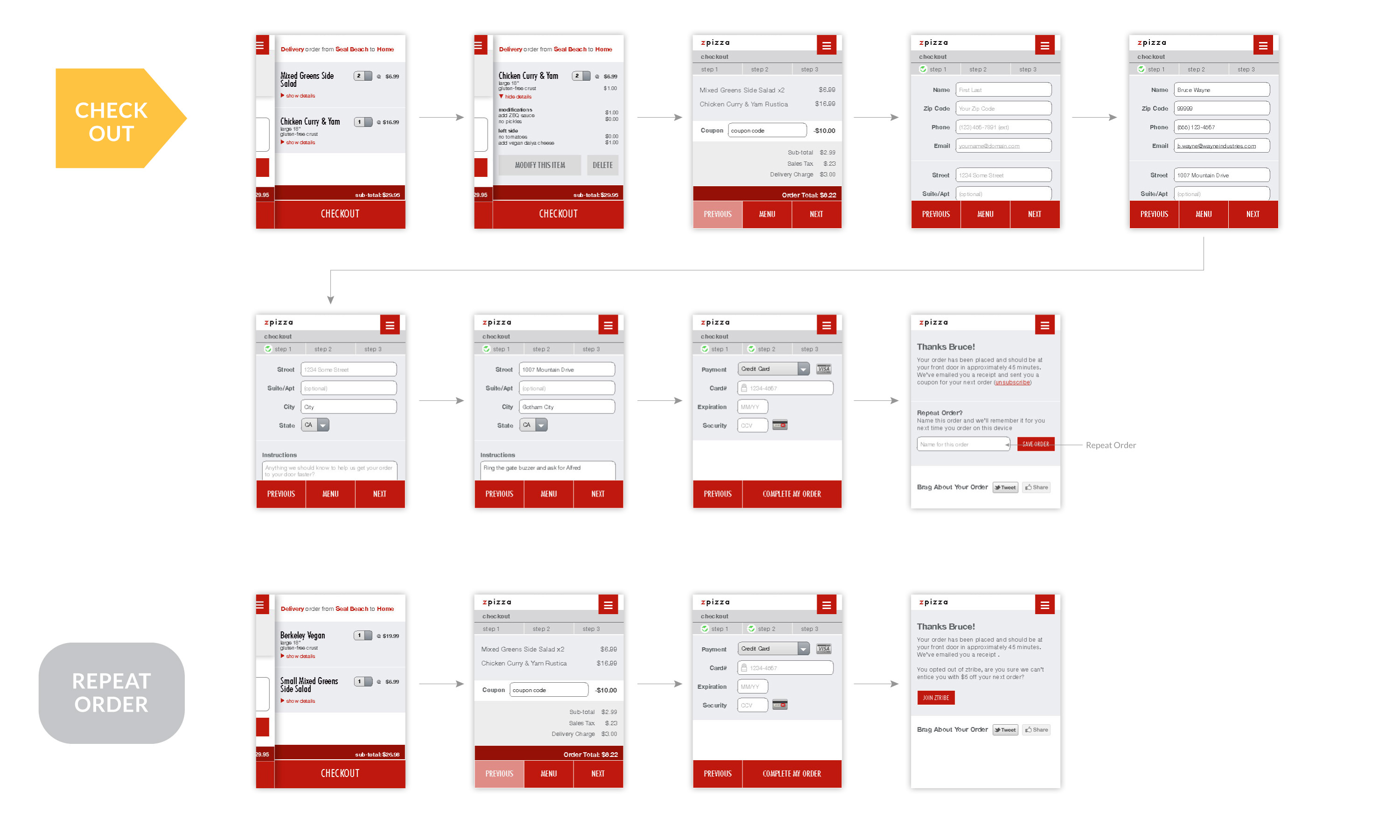
With all the information gathered, I jumped into the wireframe and constructed the user flow, with focus on the:
- First-time customer
- Returner customers
- Checkout
- Repeat order
- zTribe opt-in.
Bonus
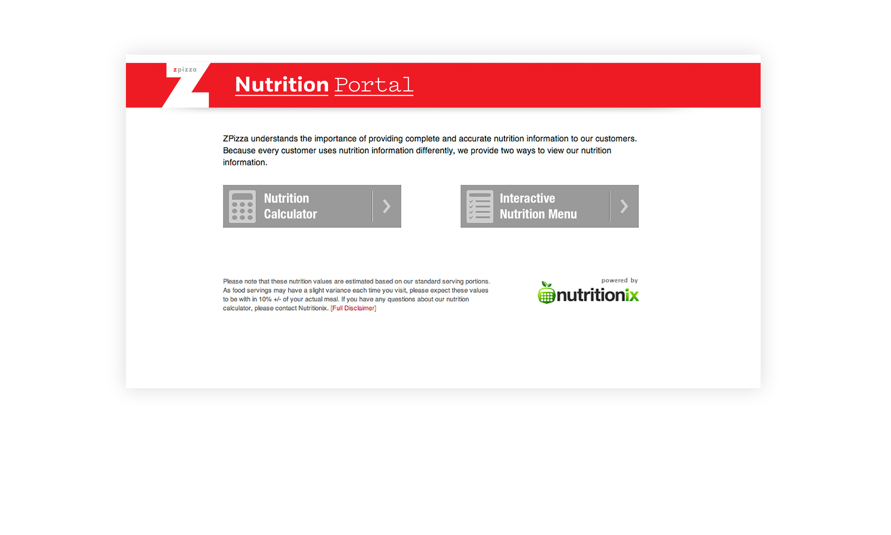
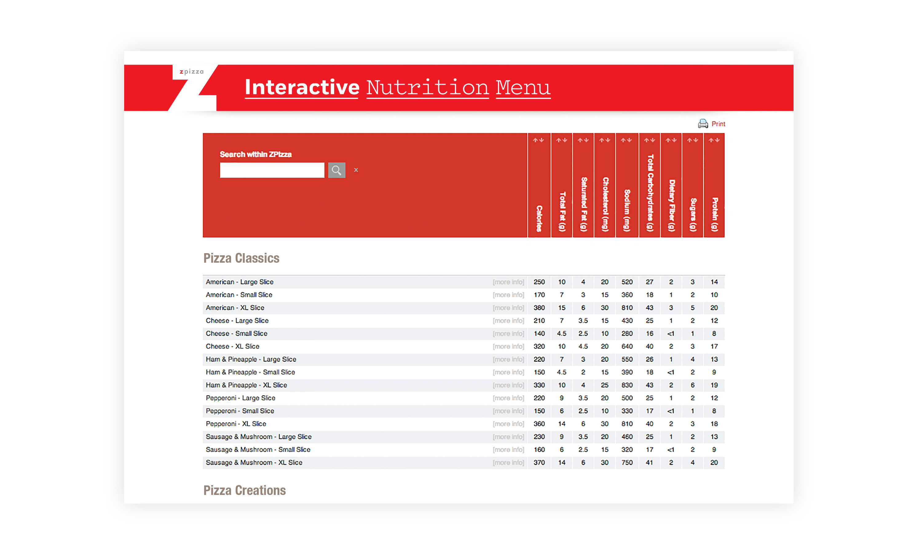
Because of zPizza‘s health-oriented brand value, we also added a bonus health calculation with the intend to educations and provide valuable nutritional information to users.
Result
With the subsequent launch of the new web experience, zPizza archived same-store sale growth of 13% to the following year.