

With the rise in popularity of crafted beer, zPizza comes up with a new idea of combining delicious pizzas with the tap beer all under one roof to appeal to both the pizza lovers and beer enthusiasts.
The creation was Taproom.
The pilot store is opened in Sacramento to test the initial concept. The team is in charge of its branding, designing, as well as collaborating with the interior design team for the overall vibe. In addition, strategy sessions are held to process and ideate customers’ journey and overall experience.


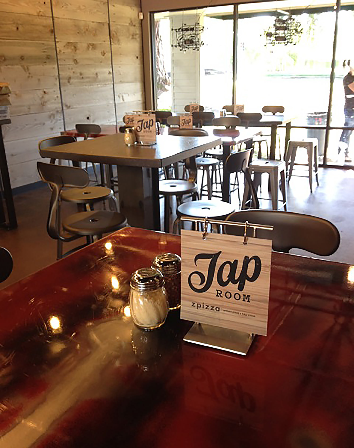
The new brand, Taproom, is created and designed in separate of the zPizza main brand. The visual and environmental design of the brand gives customers a sense of artisan, local communicate with seating and interior arrangement encourage socialization and ease of moving around.
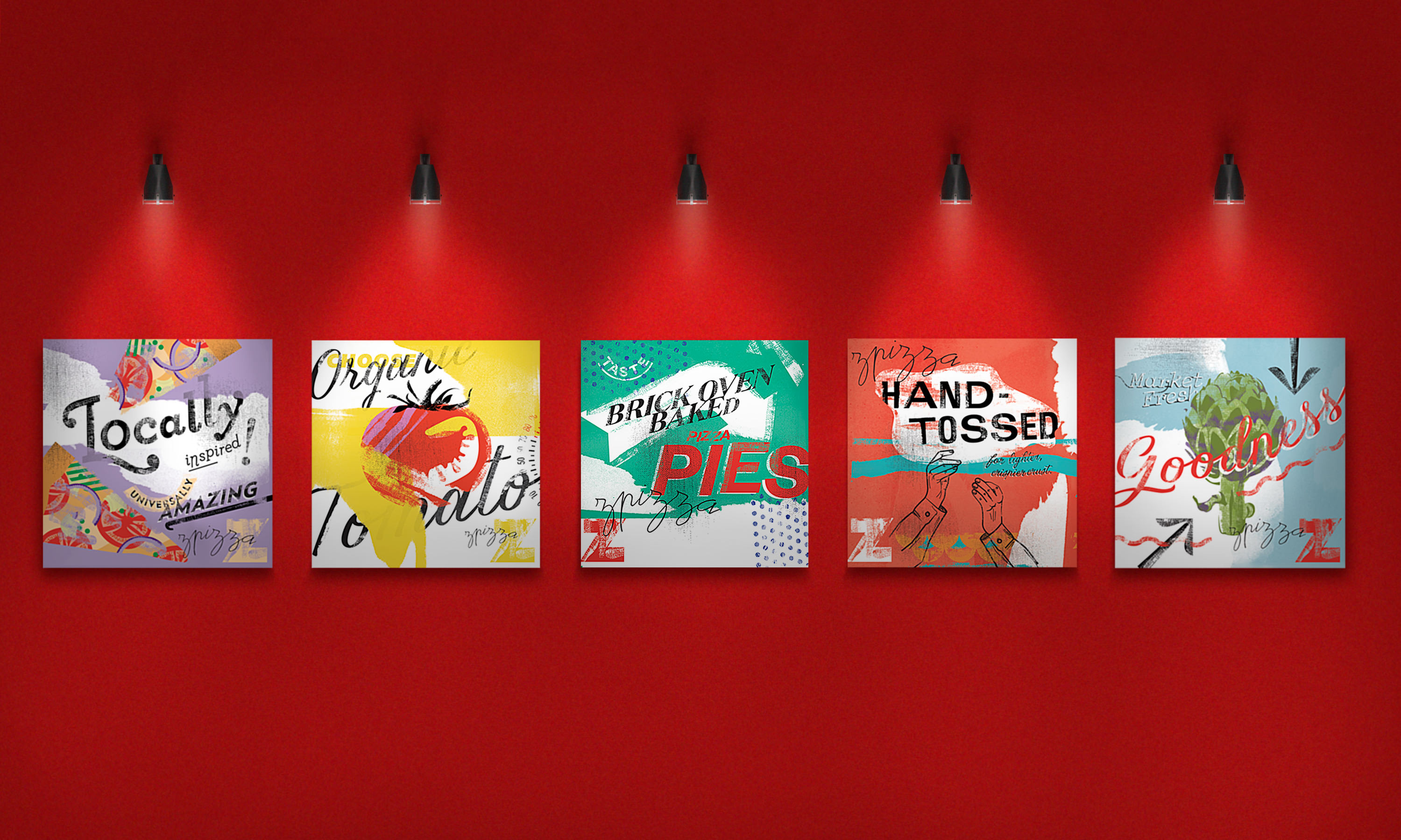
Interior deco follows a wooden, earth-tone palette pairing with the rough texture in the graphic system.


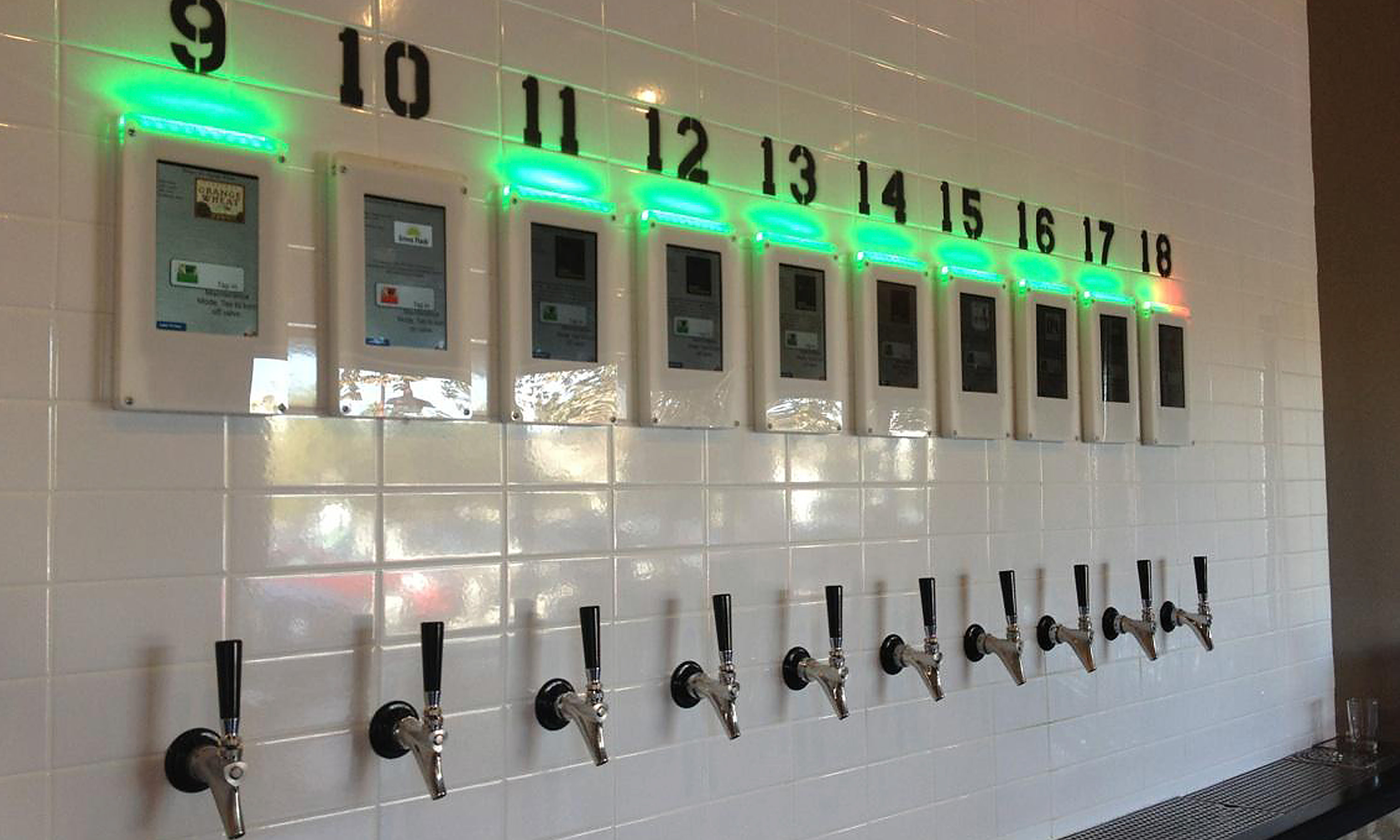
One of the innovative features is the Taproom waistband.
Instead of the traditional “open bar” ordering and payment method, each customer (of drink age) are given digital wristbands.
These wristbands, with built-in proximity sensors, are used to operate the beer taps on the wall, while simultaneously track consumption and then calculate payment amount when check out automatically.
Experiential Design meets Service Design
The initial challenge is two-fold. On one end, Taproom is poised to be popular social destinations of happy hour and after-hour goers. At the other end, Taproom still needs to maintain service of lunch-hour and regular dine-in crowd.
The solution to balance these two business objectives was to divide the room into two separated sections – tap wall area & dine-in area – each of which can work separately and also together to serve different type of need by customers.

Tap wall area features freestyle seating area & high top bench seatings. The goal is to encourage socialization and move-around.
Dine-in area is a more traditional setting with greeters, waiters, and assigned tables.

While both sides can order the services and menu items, this separation design is created with different users’ needs in mind.
In that, we have identified three key user goal and journey. They are:
The Happy Hour’er
They are there to taste different kind of beer on tap. They usually come in groups to socialize, relax and enjoy to the overall ambiance. They want to try different beer options, and they go back-and-forth seating to tap wall multiple time during their visits. They may order appetizers or small plates, but full-on dining is not their main goal.
The Regular Diner
They are there for more traditional dining in experience. Pizzas are their main course with a nice beer pairing to enhance their enjoyment. They expect greeters, waiters, and traditional services.
The Crossovers
This group crossover between tap wall area and dine-in area. Usually, they either a) visit tap wall area the socialize before dinner; or waiting for dine-in table (during busy hours); or b) visit tap wall area after the meal to continue to socialize. They want their transition between two areas to be seamless, without having to check out or pay in between.


Success
The Taproom concept proved to be a success. Patron traffic is high and so is customer satisfaction. This resulted in multiple-franchise sign-on and expanded into more locations in the coming years.
